Affiliate links on Android Authority may earn us a commission.Learn more.
Build a better UI with the Material Design Components library
August 13, 2025
One of the most common criticisms leveled at Android, is the lack of consistency between applications. Since it’s an open platform, Android gives developers the freedom to bring their creative vision to life – but this isn’talwaysa good thing from the user’s perspective. If you flick through a few apps on your Android device then chances are you’ll encounter at least a couple of applications that lookverydifferent from one another – and potentially very different from the Android system in general!
Material Design is Google’s attempt to provide a more consistent experience for Android users, and the Material Design Components (MDC) library is Google’s latest effort to drive the adoption of Material Design.
MDC is essentially a centralized repository of UI components that you can drop into your Android projects, to give them an instant Material Design look. If this sounds familiar, then it’s because MDC is actually a continuation of the Design Support Library, to the point where it even retains the Design Support Library’s import statements. However, this new library does place more of a focus on modularity, and is managed by a dedicated team of Google UX developers and designers, which means components from the MDC library should always adhere to the latest Material Design principles.
In this article I’m going to show you how to get up and running with the MDC library, by walking you through the process of implementing a range of Material Design components.
By the time you’ve completed this article, you’ll have built several Android applications that feature a BottomNavigationView, NavigationView, and a TextInputLayout and TextInputEditText combo, plus you’ll have created a scrollable app containing a CoordinatorLayout, an AppBarLayout, a CollapsingToolbarLayout, a Floating Action Button (FAB) and a snackbar.
Adding MDC to your project
Throughout this article, we’re going to create a number of apps that demonstrate the various MDC library components in action.
To help keep each example as straightforward as possible, I’m going to be implementing these components across various projects. Everytime you create a new project, you’ll need to add the MDC-Android library as a project dependency, although since the Material Component Library is a continuation of the Design Support Library, this looks exactly the same as adding the Design Support Library.
Before you start, check that you have the latest version of the Support Repository installed by opening the Android SDK Manager, selecting the ‘SDK Tools’ tab and downloading any available ‘Support Repository’ updates.
Next, open your project’s module-level build.gradle file and add the latest version of the MDC/Design Support Library to the dependencies section:
Adding the Material Design Library Components to your project
Many of the MDC components are designed to be used together, and the first app we’re going to build is a perfect example of how you can often deliver a better user experience, by combining multiple MDC library components on a single screen.
In this first section, we’re going to build an app that consists of:
Since CoordinatorLayout, AppBarLayout and CollapsingToolbarLayout are primarily designed to contain other content, we’ll also be implementing some scrollable content, so you can see exactly what impact these MDC containers have on the other Views in your layout.
CoordinatorLayout
As the name suggests, CoordinatorLayout is a layout that helps you coordinate how its child Views interact with one another.CoordinatorLayouts have a couple of useful attributes that you can apply to its child Views, most notably app:layout_anchor which lets you attach one View to another, and app:layout_insetEdge, which you can use to define inset edges.
In this particular application, we’re using a CoordinatorLayout as it’ll also allow us to implement an AppBarLayout, which in turn means we’ll be able to use a CollapsingToolbarLayout. It also means we’ll be able to create a Floating Action Button (FAB) that’ll slide out of the way automatically whenever this app needs to display a snackbar.
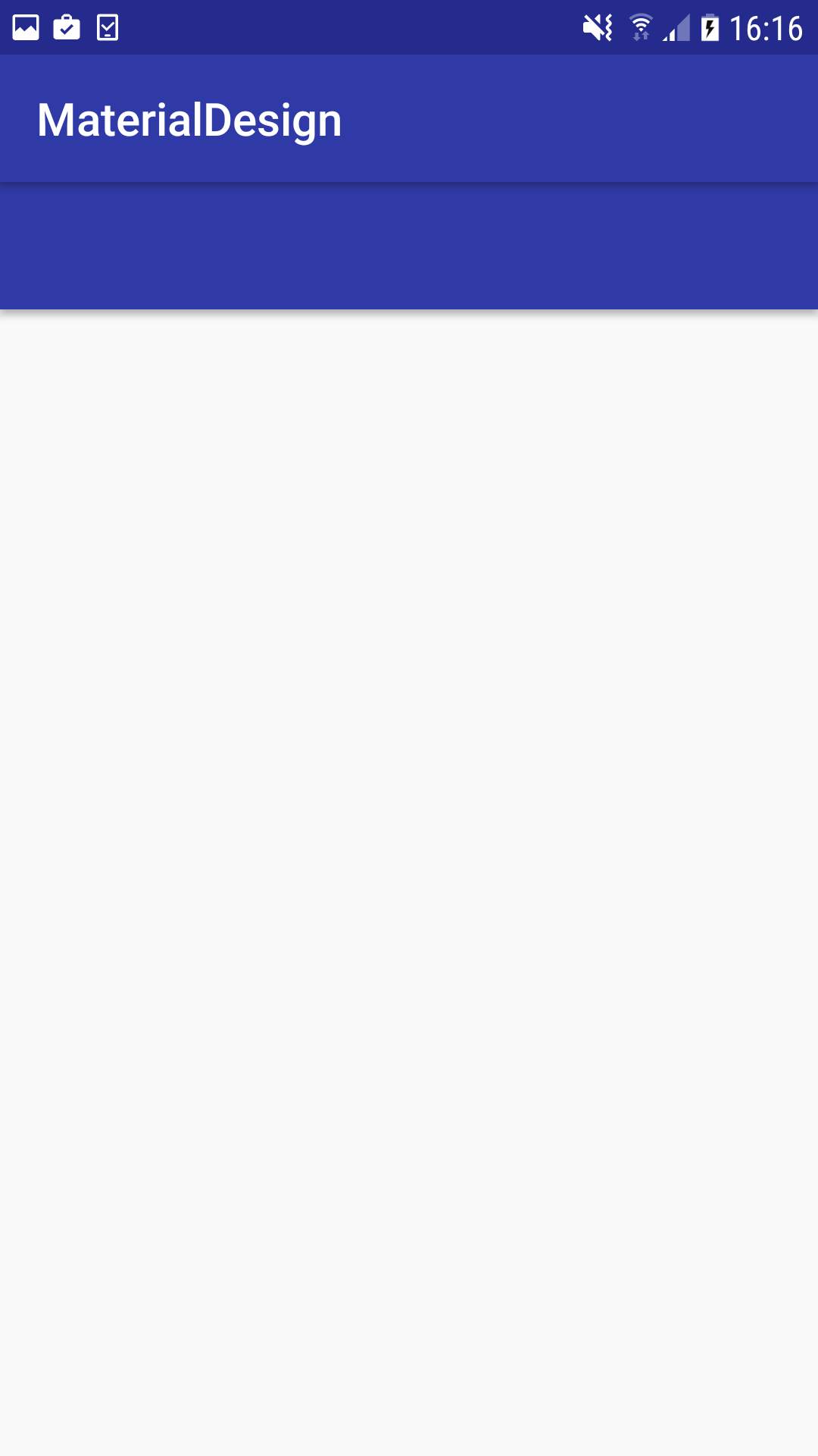
To create a CoordinatorLayout, open your main_activity file and add the following:
AppBarLayout
By implementing an AppBarLayout, we can define how all of its child Views respond to scrolling events, via the app:layout_scrollFlags attribute.
Once you’ve applied app:layout_scrollFlags to a View, you can set it to one, or more of the following flags, depending on the scrolling behaviour you want to implement:
You implement an AppBarLayout using the following:
CollapsingToolbarLayout
The next bit of setup we need to complete, is implementing a CollapsingToolbarLayout, which is a wrapper for Android’s Toolbar component.
A CollapsingToolbarLayout allows us to define how our toolbar content should collapse and expand in response to scrolling activity, via the app:layout_collapseMode attribute.
Once you’ve implemented a CollapsingToolbarLayout, you can add the app:layout_collapseMode attribute to any of your toolbar elements, and then set it to one of the following values:
Since the CollapsingToolbarLayout is intended to be wrapped around a Toolbar, let’s add both of these components to our layout:
At this point we’ve used multiple components from the MDC library to create a structure that offers us precise control over how all its child Views respond to scrolling events. However, since we haven’t added any content to our toolbar or the main body of our application, we can’t actuallyseeany of this behavior in action. As a result, our app currently doesn’t look all that impressive!
To get a better idea ofwhywe’ve gone to the effort of implementing all these MDC components, let’s add some actual content to our app.
1. NestedScrollView
A NestedScrollView is similar to a ScrollView, but with nested scrolling enabled by default. Although this View isn’t part of the MDC library, since it’s a child of AppBarLayout thereisone MDC attribute we need to add to our NestedScrollView.
When you’re using an AppBarLayout, you need to create an association between that AppBarLayout and the View that’s going to be scrolled, which in our case is the NestedScrollView. You create this association using the ‘appbar_scrolling_view_behavior’ string resource that’s included in the MDC library. This string resource maps to the AppBarLayout.ScrollingViewBehavior method, which ensures the AppBarLayout is notified whenever a scroll events occurs on our NestedScrollView.
2. ImageView
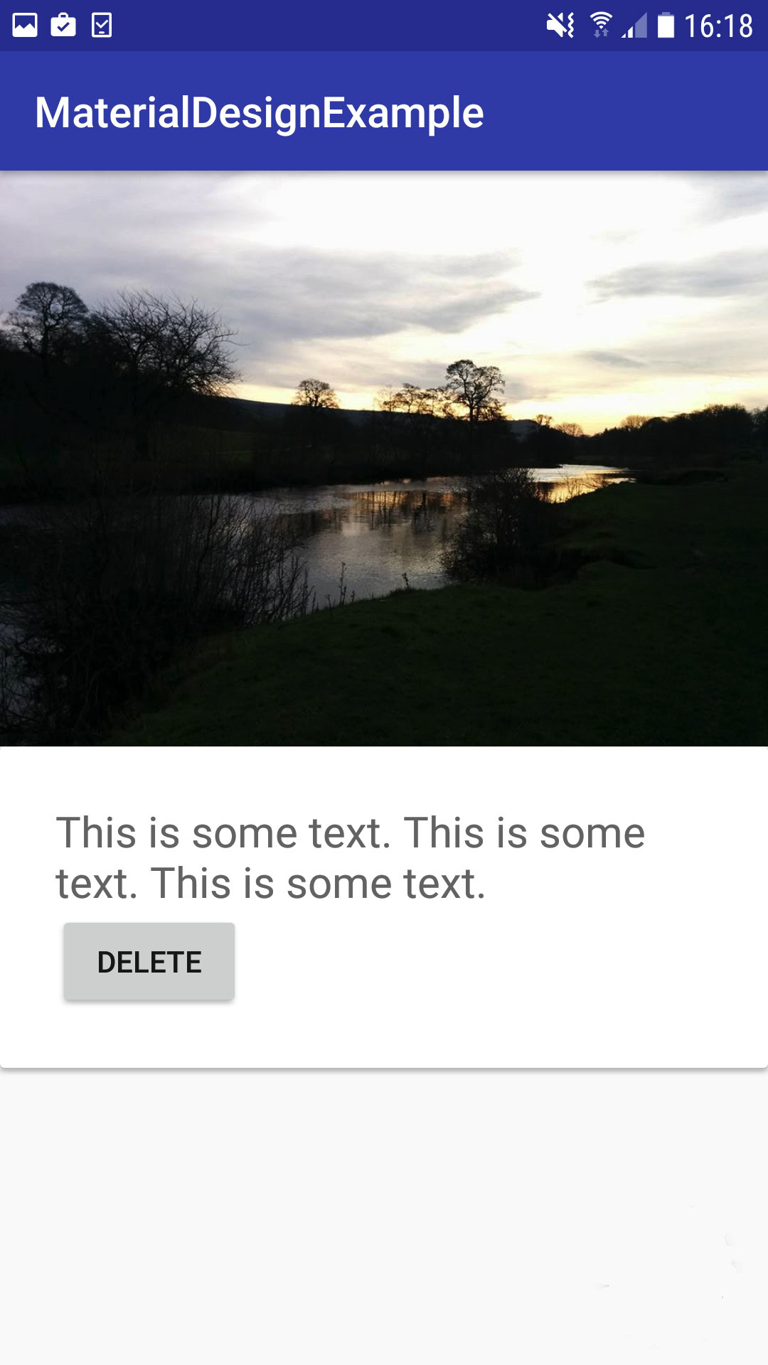
To see how the content inside our CollapingToolbarLayout expands and collapses in response to scrolling events, let’s add an ImageView to the toolbar. This also gives us the chance to see our scrim in action.
Find an image you want to use as your collapsing toolbar’s header, drag it into your project’s drawable folder, and then add an ImageView to your project:
3. CardView
To see exactly what impact our scroll flags have on our scrollable content, let’s add a CardView widget to our NestedScrollView, and then create a card with some content.
Open your module-level build.gradle file and add the CardView library as a project dependency:
Open your strings.xml file and define some text that to display as part of our CardView:
Then, open your layout resource file and add your CardView to the NestedScrollView element:
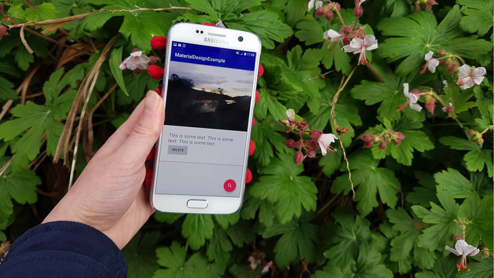
Install this project on your Android smartphone or tablet, or a compatible AVD (Android Virtual Device), and try scrolling the layout up and down. As you scroll upwards, the ImageView in the CollapsingToolbarLayout should collapse, and the scrim should appear, creating a “fade out” effect.
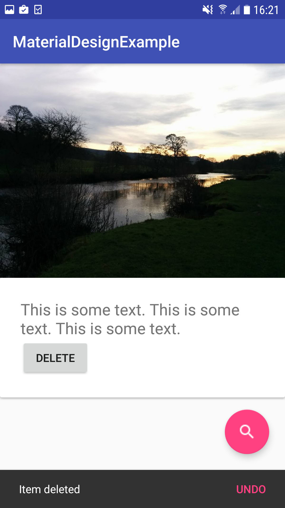
That’s the scrolling portion of our sample app finished, however there’s two more MDC elements where our CoordinatorLayout parent can come in particularly useful: snackbars and FABs.
In the next few sections, we’re going to create a FAB and purposefully position it in in the area of the screen where Android displays snackbars by default. We’ll then create a snackbar that’ll appear whenever the user taps the Button we added to our CardView.
While this may seem like a recipe for disaster, since we’re using a CoordinatorLayout as our parent layout, we can give our FAB the ability to slide out of the way automatically, just by adding a single line of code.
Floating Action Button
A FAB is a button that appears to float above your UI, and is intended to help emphasize a screen’s primary action, also sometimes known as the promoted action. If you launch the Gmail app and navigate to your inbox, then you’ll see a FAB that you may use to compose a new message.
It’s recommended that you only ever display one FAB per screen, so you should use a FAB to represent the action the user is most likely to perform whenever they launch this particular Activity. You should also only use FABs for positive actions, such as Create, Share and Favourite, and avoid using FABs for negative or destructive actions like Trash or Archive.
you’re able to create a basic FAB, just by adding the following to your layout resource file:
While this is all you need to create a simple FAB, there’s several attributes you can use if you need to customize your FAB’s appearance:
We’ll also need an icon to display in our FAB. In the interests of providing a consistent user experience you should use the icons from theMaterial Icons sitewherever possible, so head over to this website, download the icon you want to use and then add it to your project’s drawable folder.
You can then create your FAB. Since this is the last change we’re going to make to this particular project’s activity_main.xml file, let’s review its entire contents:
The final component we’re going to add is a snackbar, which is a popup that can display a single line of text.
Snackbars are typically used to provide the user with instant feedback on an operation they’ve just performed. While this may sound similar to Toasts, there are two areas where snackbars are considerably more powerful than Toasts:
1. Snackbars support actions
Toasts are a one-way dialogue: you may use them to display some information, but the user has no way to respond to this information.
By contrast, snackbars support action buttons, which makes them an ideal way of confirming that an action has just been completed, while giving the user the option to reverse that action. For example you could display a “This email/file/picture has now been deleted” message, with an accompanying “Undo” action button.
A snackbar can only ever display a single action; if you need to display multiple actions then you should use a dialog instead. In addition, you should never add a ‘Dismiss’ or ‘Cancel’ action to a snackbar, as there’s already a number of ways that the user can dismiss a snackbar, so this is just a waste of an action button!
And lastly, snackbars vanish automatically after a period of time has elapsed, or as soon as the user tries to interact with other UI elements. Therefore, you shouldn’t use a snackbar as the sole means of performing an important action – if you do add an action button to your snackbar, then you should always provide the user with an alternate means of performing that action.
2. Snackbars can be dismissed
By default, a snackbar will close after a set period of time has elapsed, when a new snackbar replaces it, or when the user interacts with another onscreen element or navigates to a new Activity. However, if you place a snackbar inside a CoordinatorLayout, then the user can also dismiss a snackbar by swiping if offscreen.
Since we’re adding our snackbar to a CoordinatorLayout, we also have the ability to ensure our FAB shifts out of the way whenever the snackbar appears onscreen. To create this effect, you simply need to pass the CoordinatorLayout to the snackbar’s make() method, for example:
The ‘make’ method takes three parameters:
Let’s create a snackbar that’ll appear whenever the user taps the button we added to our CardView. To make things more interesting, I’m going to add an action button to this snackbar, using the setAction() method. Tapping this action button will trigger a second snackbar, replacing the first snackbar in the process.
Open your project’s MainActivity file and add the following:
Take a look at your FAB and snackbar in action, by installing you updated project on your Android device or AVD, and then tapping the Button to trigger the snackbar. The FAB should animate out of the way automatically.
At this point, you’re able to test another feature that comes courtesy of CoordinatorLayout: swipe-to-dismiss. Drag the snackbar to the right and it should disappear, and the FAB should react by shifting back to its original position.
Trigger the snackbar again, and this time tap the “UNDO” action button. This will trigger a second snackbar, which again you’re able to swipe offscreen by dragging it to the right.
You candownload this project from GitHub.
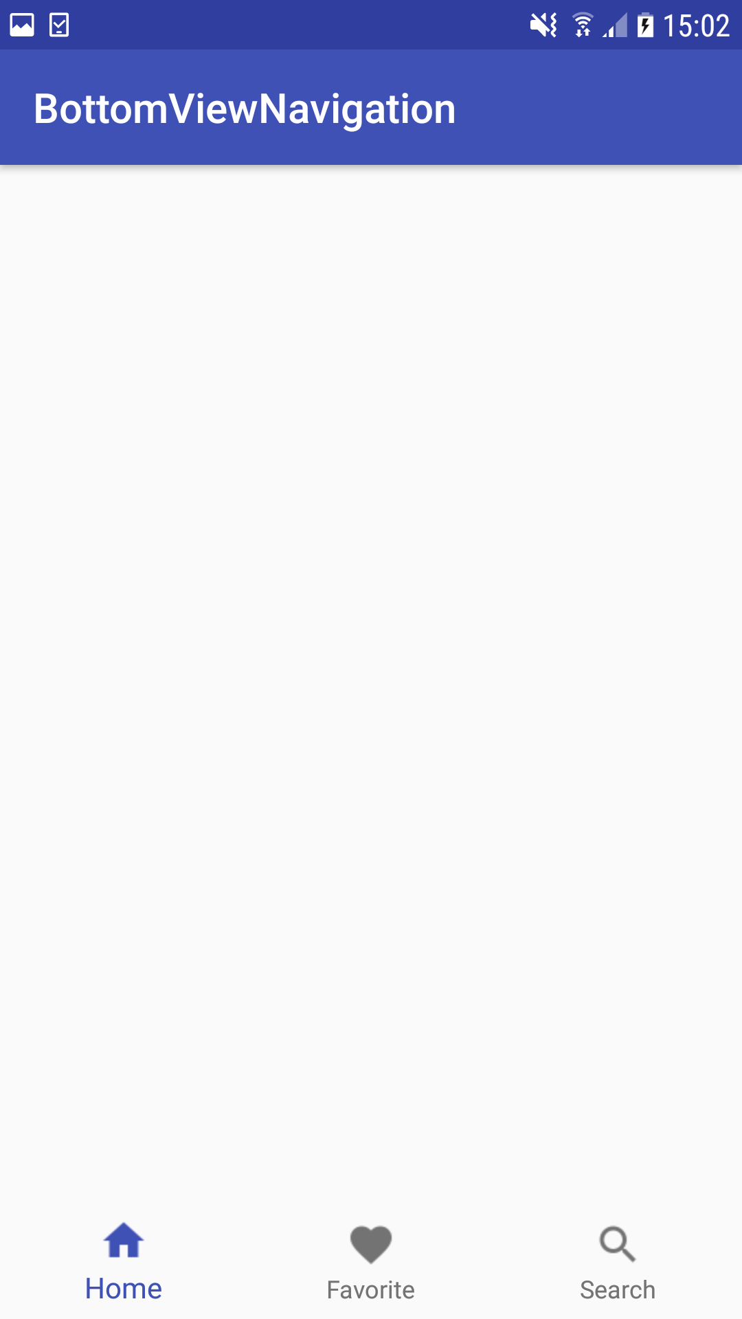
BottomNavigationView
The next MDC component we’re going to look at is BottomNavigationView, which is a standard navigation bar that’s displayed along the bottom of the screen.
A bottom navigation bar is ideal for providing the user with quick and easy access to your app’s most important destinations, although a BottomNavigationView can only support a maximum of five items. If your top-level navigation consists of six or more items, then you should use an alternate navigation method, such as a navigation drawer.
In the interests of keeping our code as straightforward as possible, either create a new layout resource file or, ideally, create a new project. If you do create a new project, then remember to add the MDC library as a project dependency, by opening your module-level build.gradle file and adding the following:
We’re going to need an icon for every item in our bottom navigation menu, so download three icons from theMaterial Icons siteand then drag them into your project’s drawable folder.
You populate the bottom navigation bar by creating a dedicated menu resource file, where you’ll define each that you want to display in your navigation bar.
If your project doesn’t already contain a ‘menu’ folder, then you’ll need to create one:
Next, you’ll need to create your menu resource file:
Open the menu resource file and define each item you want to display in your navigation bar:
Next, open the layout resource file where you want to display your BottomNavigationView, and populate it with the contents of your menu resource file:
NavigationView
A NavigationView is a scrollable navigation drawer that can give the user instant access to all the most important locations in your app. This can be particularly useful if your app consists of a large number of screens.
To create a NavigationView, you’ll need to:
Each menu item in our NavigationView will consist of a short title and an action, so head over to theMaterial Icons siteand download a selection of icons. I’ll be using ic_info, ic_add, ic_attach, ic_cloud, ic_add_photo, ic_search, and ic_settings, plus I’m going to display the ic_account icon in my navigation header. Drag all the icons you want to use into your project’s res/drawable folder.
To create your navigation header:
Open this new layout resource file and define the layout you want to use as your navigation drawer’s header:
Next, you’ll need to define all the menu items you want to display in your navigation drawer:
Open the drawer.xml file and define all your menu items. I’m going to divide my list of menu items into two different groups:
The final step is to open your activity_main.xml file and implement your actual NavigationView element, plus a DrawerLayout parent layout:
Install this app on your Android smartphone, tablet or AVD, and then drag the navigation drawer from the left-hand side of the screen. It should look something like this:
TextInputLayout and TextInputEditText
The final two Material Design components we’re going to look at, are designed to be used together.
The TextInputLayout and TextInputEditText components make a minor, but useful tweak to the android:hint attribute that’s commonly used to display temporary text inside an EditText. Hint text can help the user understand what information they need to enter into an EditText, however as soon as the user selects that EditText and starts typing, that hint text disappears.
While this behavior ensures that the user can actuallyseewhat they’re typing, it can present a problem if the user starts entering information into an EditText and then gets distracted. By the time they return to your app, they may have forgotten the contents of the android:hint attribute, and consequently have no idea what they’re supposed to be entering into the EditText.
Admittedly this is a very specific use case, but when it does happen, it can be very frustrating, so you should take steps to ensure this situation never occurs in your Android apps.
The TextInputLayout is a component that you can wrap around an EditText to tweak the default behaviour of the android:hint attribute. Initially, your hint will be displayed inside the EditText as normal, but as soon as the user selects the EditText, the hint will transform into a floating label. This floating label remains visible above the EditText for the entire time that EditText is in focus.
Initially, it was recommended that you wrap the TextInputLayout component around a plain EditText element, however this prevents the user from being able to see the hint text when their device is in Extract mode.
Extract mode, also sometimes known as Full Screen, is the mode that the keyboard editor switches to when you tap on an EditText when you’re in landscape mode. The input method editor (IME) extracts the EditText into a full screen view, at which point your floating hint text is no longer visible.
To verify the user can see your hint text in Extract mode, Google introduced the TextInputEditText component, which is essentially an EditText with an additional field that makes the hint text visible in Extract mode, although the drawback is that it’ll appear as a regular hint and not as a floating hint.
Let’s take a look at these two UI elements in action. Open your activity_main.xml file, and create two TextInputEditTexts – one that asks the user to enter their password, and another that asks them to enter their email address, and wrap them both in a TextInputLayout.
Install this app on a compatible Android device or AVD. Initially, your TextInputEditTexts will look just like regular EditTexts, but as soon as you select either of them, the hint text will transform into a floating label.
Check that the android:hint attribute is visible in Extract mode by selecting one of the EditTexts and then switching your device to landscape orientation.
Wrapping Up
After completing this article, you know how to a implement a wide range of components from the MDC library in your Android apps, including CoordinatorLayouts, CollapsingToolbarLayouts, TextInputLayouts and TextInputEditTexts.
Will you be using components from theMDC libraryin your own Android projects?
Thank you for being part of our community. Read ourComment Policybefore posting.
